A First Look at Squarespace Fluid Engine - How to Use The New Layout Editor
In June this year Squarespace launched their brand new drag & drop design editor which is known as Fluid Engine. I couldn’t wait to give it a try in the initial trial release to Circle members, and so I decided to design a full Squarespace website template using the new Fluid Engine editor. I've included a video of first time designing in Fluid Engine, plus an easy step-by-step guide of some of the key changes that come with Fluid Engine - perfect for beginners!
So what’s new in Squarespace Fluid Engine?
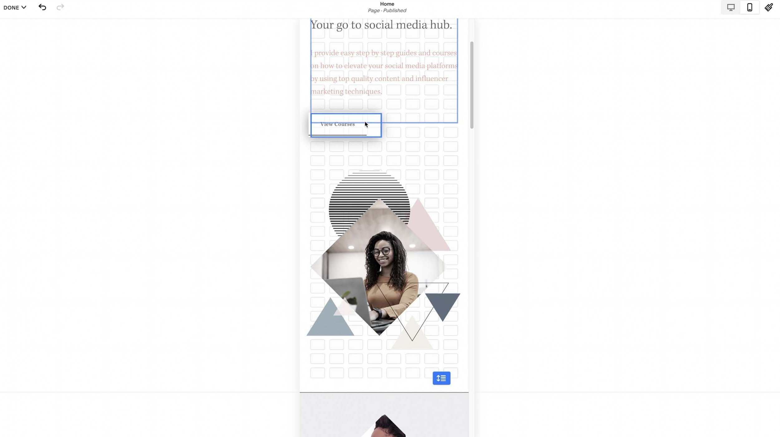
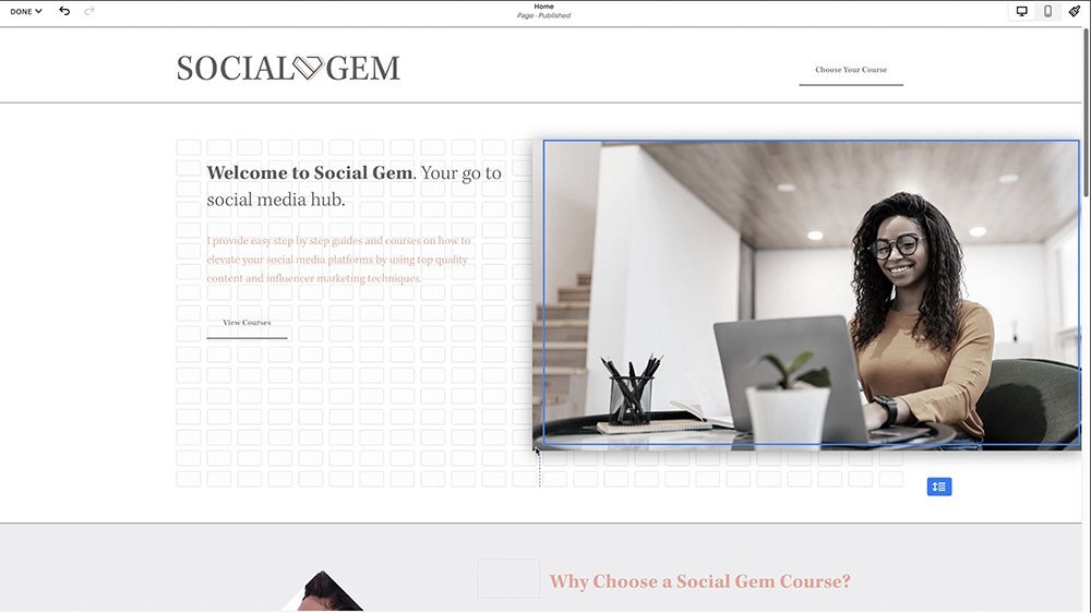
A full grid system design that elevates the ‘Drag & Drop’ function for all blocks
Let’s look at the most obvious change first - The grid. Instead of adding a ton of spacers all over your sections the new drag & drop grid system allows you to simply drag blocks in any position you like, as well as full width flush edged image blocks which is a a very welcome feature :) You can also drag more blocks at once by simply selecting all blocks together then drag to reposition, and even bulk delete blocks all together!
One of my absolute favourite features of the new Fluid Engine is the ability to now overlap blocks without the need of any CSS code. So for example if you would like an image block or a text block to overlap another block you can simply drag it across and using the overlap tool you can position in front or behind any block. Finally! I am in love already!
Independent Mobile Editing - YES YES YES!
Now this is a BIGGY. With the new Fluid Engine editor you can now update the way content is viewed on mobile devices. So this means no more having to put up with stacked images and layouts in set positions. This is by far one of the best features Squarespace has introduced in my opinion. By now we no that the world is hooked to mobile devices and over 55% of purchases are made via a mobile phone, so it’s so important to get the design and function of the mobile responsive design spot on.
With the new Fluid Engine editor you can simply click on the mobile view (top right) and there you will see the Fluid Engine editor appear. You can resize blocks directly on the mobile view without effecting any of the desktop design. You can completely reposition images blocks, move them up or down, side by side or even overlap! I love it!
Fluid Engine Image Block Updates
The old way of resizing images with spacers will be a thing of the past! We can now enjoy the ease of resizing image blocks by simply clicking the corner of the image to resize. There’s also a fill or fit tool to position your images within a space or flush to the edge of the block. Neat!
Section Editor To Control The Grid
The new grid editor in Fluid Engine is a great tool, especially if you want to set spacing in between blocks without the need of spacers. Here’s are the grid settings:
Row Count - Set the number of rows in the section's grid. This is the only section style option where you can have different settings on the computer and mobile layout, but the minimum number of rows is also dependent on how many blocks you've added and how they're arranged.
Gap - Set the space between units in the grid to control how much space there will be between blocks. You can choose no gap, a preset gap, or click to set custom vertical and horizontal gaps.
Height - Add padding to your section outside the section grid. You can choose between small, medium, or large height, or click ... to set a custom height.
Alignment - Set where the extra height padding appears. Align content to the top to add padding below the content. Align content in the centre to add padding above and below the content. Align content to the bottom to add padding above the content.
Viewport - Enable this setting for more control over the height and alignment of your content. If you don't want padding around the section content, leave it disabled. The following options only appear if viewport is enabled.
Note: Make the grid stay visible by pressing G. Press G again to hide the grid.
Fluid Engine is currently supported on 7.1 sites for:
Block sections on any page
Footers
Portfolio sub-pages
How To Add Fluid Engine To Your Site:
Squarespace is rolling out the new Fluid Engine editor to all 7.1 websites. If you are a circle member go to > settings click > circle labs toggle the > Fluid Engine tab on.
How To Add A Fluid Engine Section To A Page:
Click Edit on the page.
Click Add Section.
Click Add Blank + to add a blank Fluid Engine section, or click a category to find pre-built sections. Just to note if the section has an ‘i’ icon in the top-right corner, it's an auto layout that doesn't use Fluid Engine.
What Will Happen To my Classic Site?
Don't panic! Your existing site will remain the same unless you opt to convert or upgrade your classic editor sections to the new fluid engine. You'll find this option whenever you hover over an editable section of your website pages - You will see the button below, and this will change your classic editor content into a Fluid Engine version. Just know that when you do this, there's no going back!
In order for Squarespace to move all websites from classic editors to the newest fluid engine versions, any newly-created pages will automatically use this latest software. The only way for you to access the old styled editor is if you copy pre-existing pages (either by duplicating an entire page with its pre-existing classic editor content) or duplicate entire sites using the classic editor.
Do I have To Upgrade?
If you don’t make many changes to your website, then you are fine to stay with the Classic Editor, however if you regularly create new pages and content it may be wise to try and get a handle on the new Fluid Engine editor.
How To Learn The New Fluid Engine
Before you go and convert all your sections over, I definitely recommend testing the Fluid Engine editor out on new unlinked pages. While it might seem daunting at first, try converting only certain pieces of content until you're more used to using this tool.
Check out my Fluid Engine demo video. Plus all templates on my shop include the new Fluid Engine Tutorial.
My Thoughts On Fluid Engine
To conclude, my overall impression of Fluid Engine is that it comes with a variety of welcomed features, it has much more flexibility in design and way more capacity to customise mobile layouts. These key points alone are what make Fluid Engine an impressive new layout editor in my opinion. I do have some minor concerns in terms of businesses who have designed many websites with the classic layout editor, and therefore may have to pass their knowledge on to clients to make sure they are fully trained in Fluid Engine, which for some could be quite a headache. However I am hoping that the Squarespace development team realise this and allow a choice between the classic editor and the new Fluid Engine. For me personally I welcome the change! But pleeease could someone bring back the classic 7.0 menu headers in 7.1, surely Squarespace will answer our prayers to this soon! 🙏🏼
What are your thoughts on the new Fluid Engine? Love, hate? or totally in the middle? …


