How to change the Squarespace cookie banner design
Create a more stylish Squarespace cookie banner
Tired of the mundane and lackluster appearance of your Squarespace cookie banner? I get it! – the default design can be a bit dull. But fear not, because in this blog post, we're about to shake things up and inject some much-needed sass and style into your website's cookie notification. Say goodbye to the ordinary and hello to a cookie banner that not only complies with regulations but also stands out with flair. Let’s guide you through the process of transforming your Squarespace cookie banner into a stylish and eye-catching element that seamlessly integrates with your brand.
Add the below code into your custom CSS area
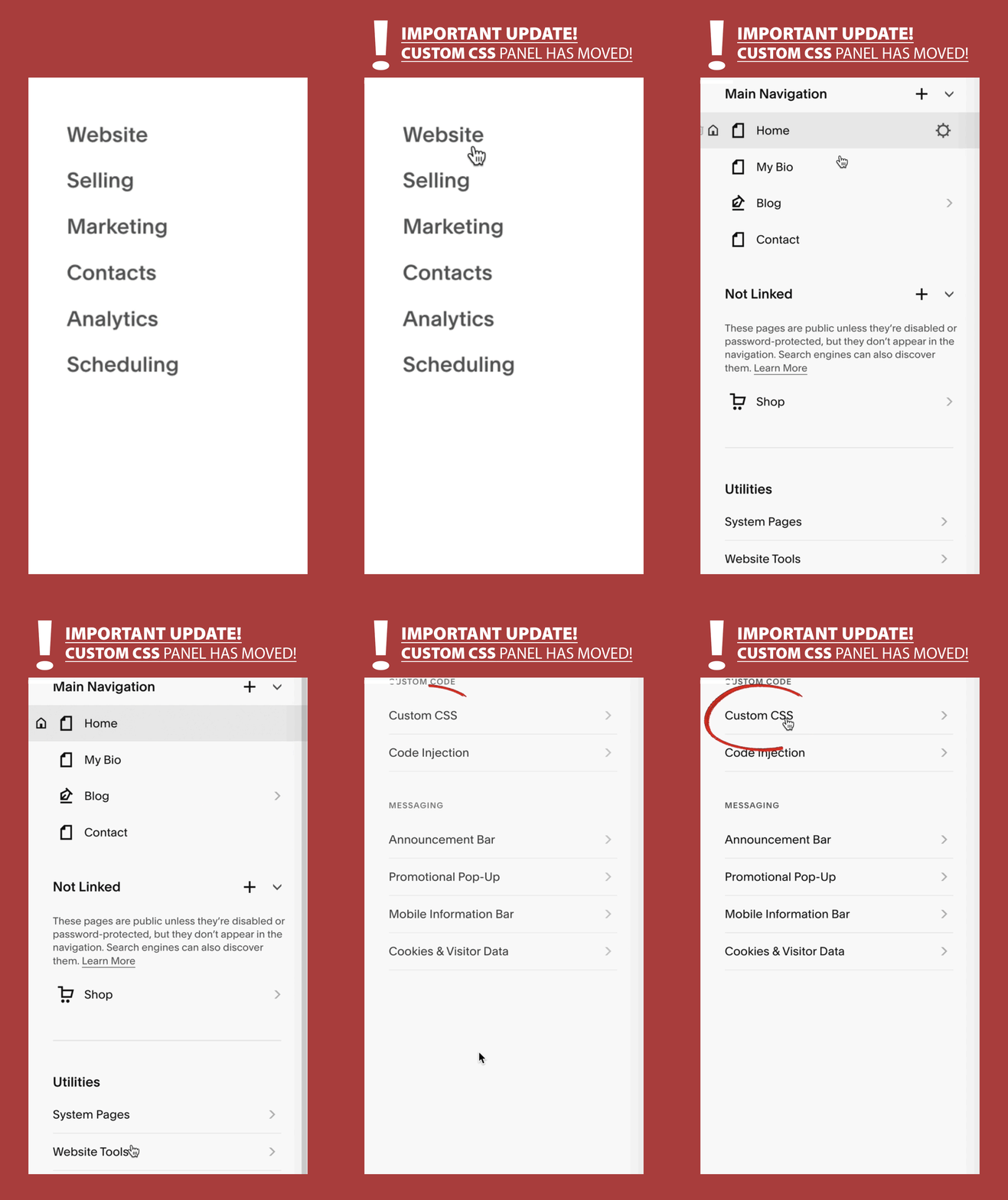
Go to Website > Website Tools > Custom CSS > then paste the below code, then hit save.
See the notes in the code below to change the colors and styles to suit your branding…
/*cookie banner styles*/
.sqs-cookie-banner-v2 {box-shadow: 2px 2px 8px rgb(44, 52, 60); //shadow
background-color:#FFF!important;} //background color
.sqs-cookie-banner-v2 {color:#000!important; //font color
border: 2px solid #000000; //border
border-radius: 20px; //border radius
}
//Button shape for accept decline
.sqs-cookie-banner-v2-accept, .sqs-cookie-banner-v2-deny {box-shadow: 2px 2px 5px #ccc;
border-radius: 10px;
padding: 10px !important;}
//button hover color
.sqs-cookie-banner-v2-accept:hover, .sqs-cookie-banner-v2-deny:hover
{background-color: #E5E1D0;}
There you have it – a Squarespace cookie banner that not only informs your visitors but also adds a touch of personality to your Squarespace site. Remember, standing out doesn't always require a complete website overhaul; sometimes, it's the small details that make the biggest impact. So, why settle for a cookie banner that fades into the background when you can make it a stylish focal point?
Let your Squarespace cookie banner reflect the unique identity of your website and brand. Say goodbye to the boring banner! Your visitors will thank you, and your website will thank you – happy styling!
You might also be interested in this guide on ‘how to force the mobile menu on desktop and tablet screens’
So thats my guide on how to create a a much more stylish Squarespace cookie banner design. For more Squarespace tips and hacks sign up to my newsletter below to be the first to catch them fresh!
Did I help you? Consider buying me a coffee as thanks!


