Koru Films
Website Design for 3rd Sector Film Company
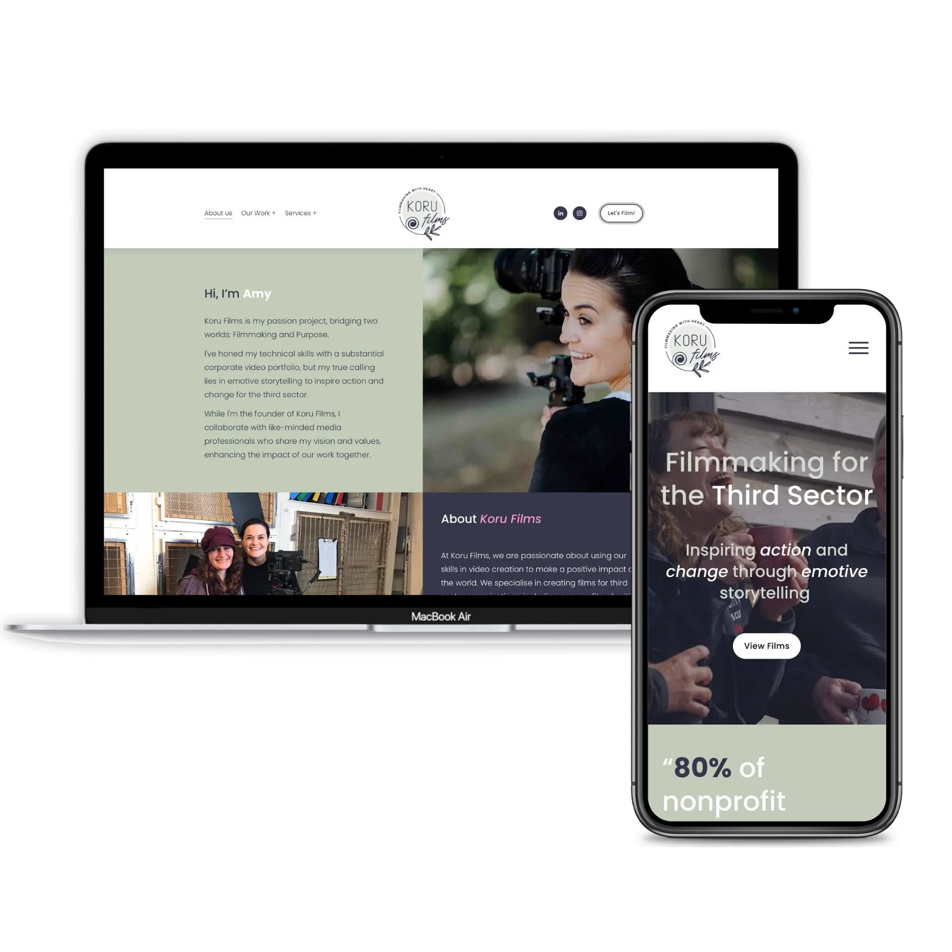
Koru Films, a 3rd sector film company based in Shropshire, recently came to me to help revamp their online presence with a focus on simplicity and user experience. This case study explores the key features of the newly designed website, aimed at making it user-friendly and visually appealing.
Key Features Of The Website…
1.Modern Design for User-Friendly Experience:
The new Koru Films website blends modern design with functionality, keeping things simple and easy to navigate. Using two primary brand colors and a touch of pink for highlights, the site offers a clean and inviting look that resonates with users.
2. Sticky Text Feature for Emphasis:
To highlight important stats and quotes in the promotion of film for the 3rd sector industry, a 'sticky' text feature has been added throughout the site. This feature allows users to focus on specific content areas while scrolling through different sections.
3.Efficient Portfolio Pages:
An important aspect for any film maker or videographer is their portfolio. In this instance the portfolio pages have been designed for quick and easy access to Koru Films' videos. Adopting a 'pop open' video format ensures users can find and watch videos without navigating through multiple pages, providing a faster and more enjoyable experience.
4.Structured Services Landing Page:
Creating a well-structured services landing page was a challenge, given the diverse film types Koru Films offers. The solution includes a large-scale gallery selection that visually showcases the ten main film types. Additionally, a service dropdown in the menu enhances user accessibility, offering a clear overview of each service.
5.On-Page SEO Optimisation:
A crucial element of the project involved executing on-page SEO for several pivotal website pages. This strategic approach was designed to enhance the website's search engine rankings and increase visibility in search results.
Customer Testimonial…
Amy Hill - Owner of Koru Films gave me a great testimonial!
“Working with Toni from The Square Genius on my Koru Films website was an absolute pleasure. Toni brought a ton of expertise to the table, making the whole process smooth and enlightening.
Toni had some really smart ideas and incorporated features into my website that I didn't even know I needed. These additions have proven to be super valuable. The site Toni designed is not just visually appealing, but it's also clean and easy to navigate. I'm genuinely proud to share it with others.
Toni's attention to detail and design skills shine through, making my website a standout. Whether you're tech-savvy or not, Toni ensures the website is user-friendly. It's a perfect balance of looking great and being easy to use.
If you're in the market for a website designer who combines expertise with a keen eye for design, Toni from The Square Genius is the way to go. Thanks for making my Koru Films website something special!”
- Amy Hill
Conclusion
In summary, the newly designed Koru Films website aims to provide a straightforward and efficient experience for visitors. With a modern design, sticky text features, and user-friendly portfolio and services pages, the site serves as a practical and visually pleasing platform for exploring Koru Films' creative offerings in the 3rd sector film industry.
Website Platform
This website was built using Squarespace .
Squarespace offers great value for money with add ons such as booking systems, email marketing and e-commerce functionality.
For more about my experience with Squarespace check out my intro here
Want to get a head start on your website design?
Take a look at some of my latest Squarespace template designs. Complete done-for-you websites, predesigned and ready to launch in no time!
For more information on our website design services please take a look at my website costs or get in touch








Web Design